


YouTube Shorts
2020 ~ Current
Product area (PA)
YouTube Shorts Ecosystem growth
Role
UX designer, PA expert
Skills
Product thinking, System design, Influencing
One of the most defining chapters of my career has been helping the team build YouTube Shorts from the ground up, then taking the product to it's next feet.
I joined the team in the summer of 2019, just as we began uncovering the core needs around short-form video (SFV) through early research. Sensing we were onto something big, we pitched the idea to then-CEO Susan Wojcicki and spent the rest of the year experimenting and shaping the product strategy. With her support, the team embraced the mission to “give everyone a voice and show them the world” through a world-class mobile video experience.
It's been an experience like no other to have witnessed the evolution of Shorts firsthand—to learn, grow, and help shape what it is today. Four years since our global launch, I wanted to reflect on a few key lessons I’ve internalized while designing for YouTube Shorts.
*Note* This isn’t a comprehensive list of features or a one-size-fits-all UX playbook for SFV. Every platform has its own ecosystem, goals, and constraints that must be considered.
Team
YouTube Shorts Consumption - Acquisition Platform
Role
UX designer & go-to person
Skills
UX design, Product thinking, System design, Influencing
🚀 Impact
💡 4 unique lessons that changed the design of Shorts

Show don't tell
Show don't tell
For short-form content, being entertaining is more important than being informative

Don't make users browse
Don't make users browse
More time people spend deciding what to watch, less satisfying Shorts become

One size doesn't fit all
One size doesn't fit all
There are many CUJs and business needs on YouTube.

Bring people together
One size doesn't fit all
Bring people together
At the end of the day, a single team can not solve all of SFV needs of YouTube. Recognizing this early on, I stepped into a connective role—becoming a go-to UX POC to many of our partner teams. I built trusted relationships across UX, PM, Eng, and Marketing to shape a cohesive end-to-end experience, while influencing teams to deeply empathize with the evolving needs of new-gen creators and viewers. This foundation helped shift Shorts from an emerging experiment to an integrated, global product presence.
Lesson 1. Show don't tell
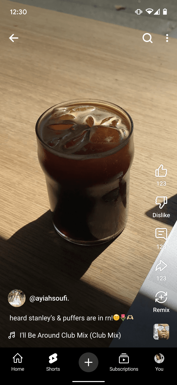
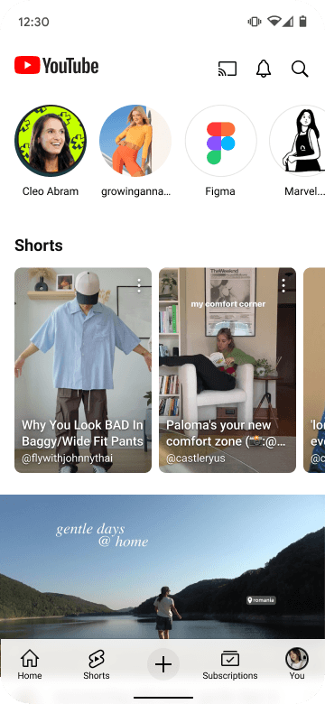
Visual first experience
Through research, we learned that time is of essence for Shorts users when they just have a moment for entertainment. Fishing for content is not rewarding because it takes precious time away.
This insight helped us shape our product principles, and initiated efforts to minimize content obstruction (1), prioritize metadata (2) and enabled inline playback (3). Such projects always led to outsized impact, strengthening it's value with growing number of engaged users.


Lesson 2. Don't make users browse
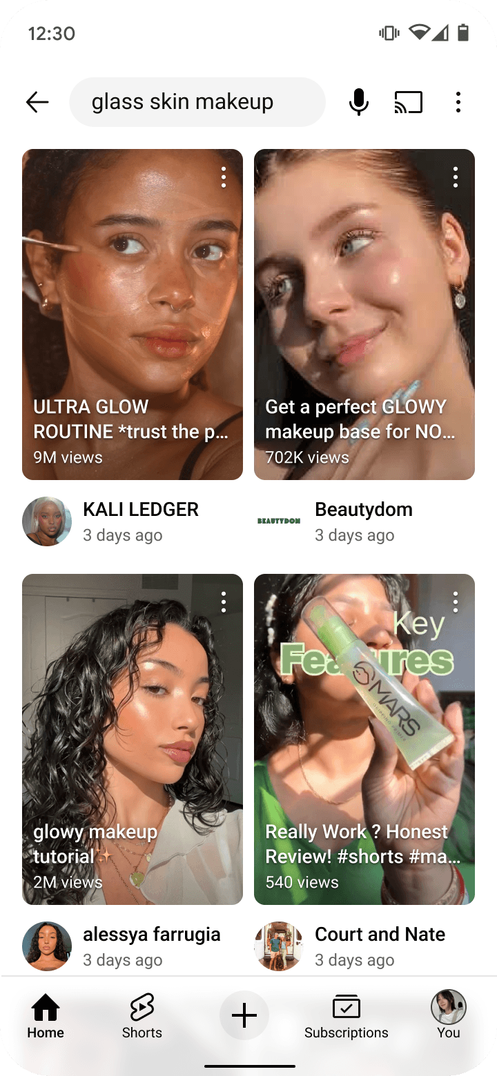
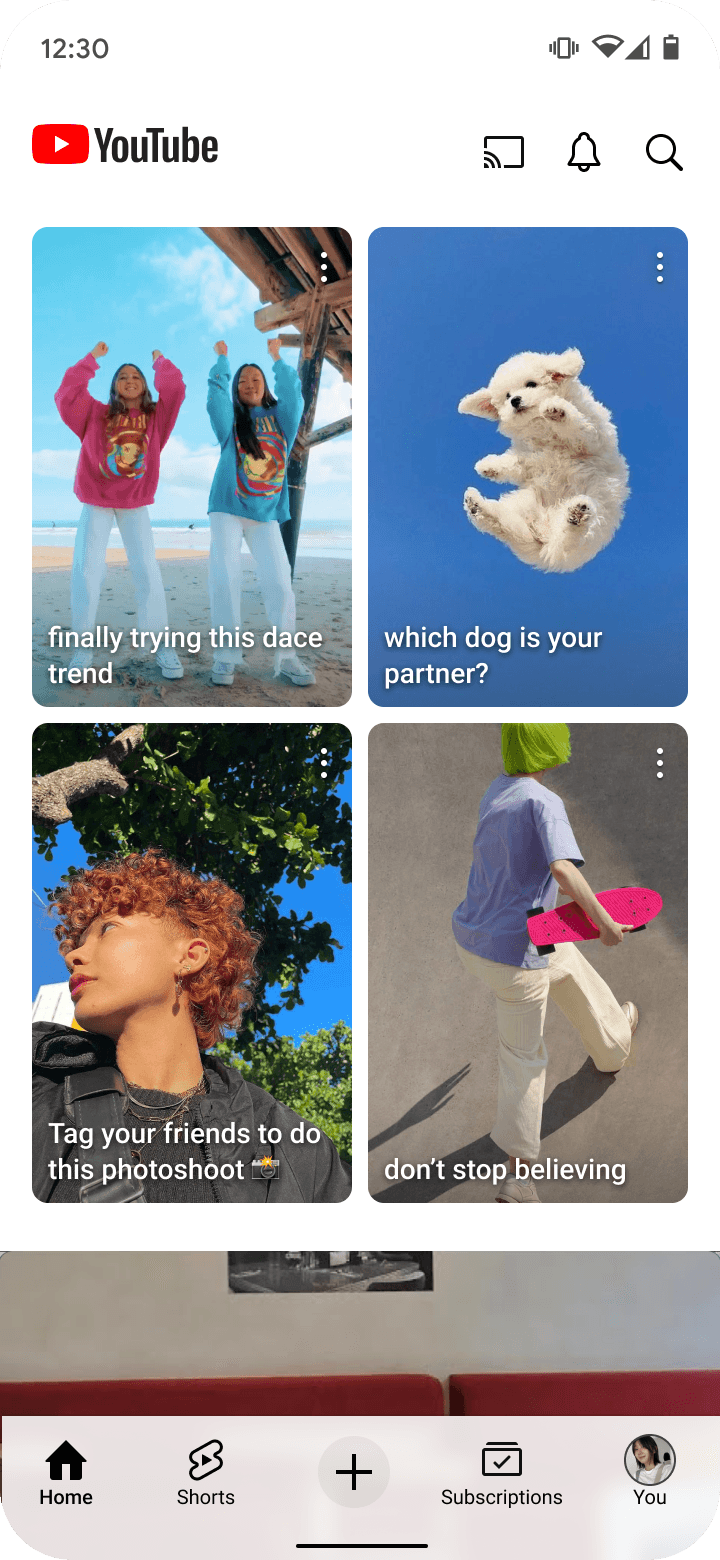
Personalized grid layout
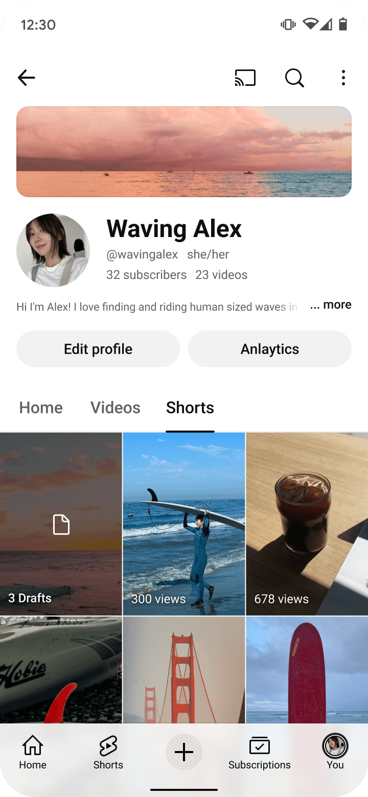
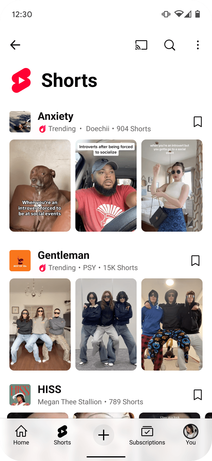
When we found out that vast majority of the users don't scroll horizontally on Shorts shelf, we explored layouts that would not interfere with a vertical scrolling behavior. It led us to experiment and launch the 2-by-2 grid that we have today.
Grids also opened a path for us to personalize interfaces. For example, users may see 1~3 rows depending on their affinity to Shorts.

Lesson 3. One size doesn't fit all
Flexible framework for different needs
As Shorts matured, we learned that there is a spectrum of user & business needs to support. One-size fits all was no longer feasible. Meanwhile, establishing clear guidelines and standardizing Shorts lockup became necessary to build a cohesive design system, to streamline process and to reduce technical debt.
With comprehensive understanding of dozens of partner teams' needs, I designed a flexible lockup system that teams can turn-on-and-off depending on their needs.
🚀 Launches
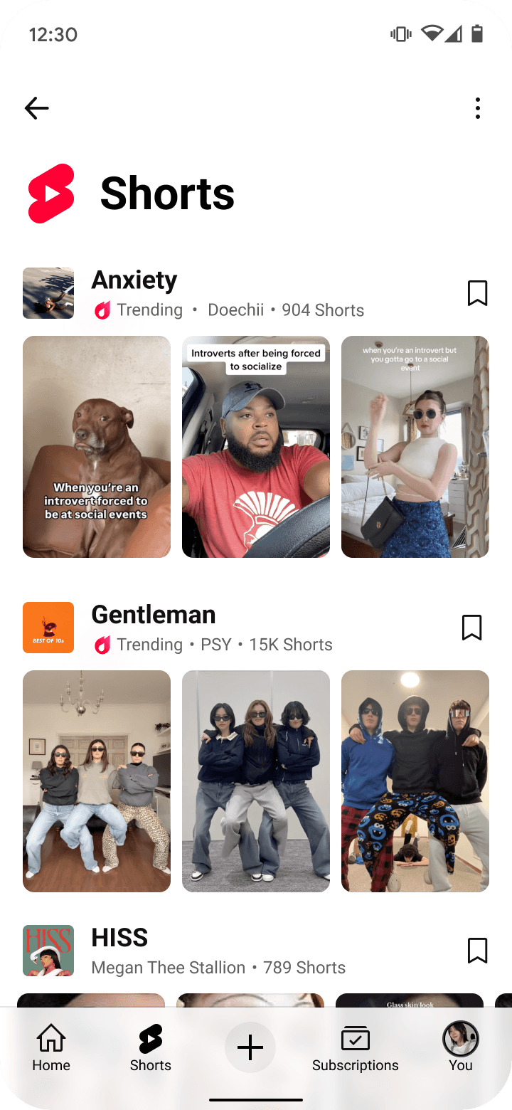
Shorts tab
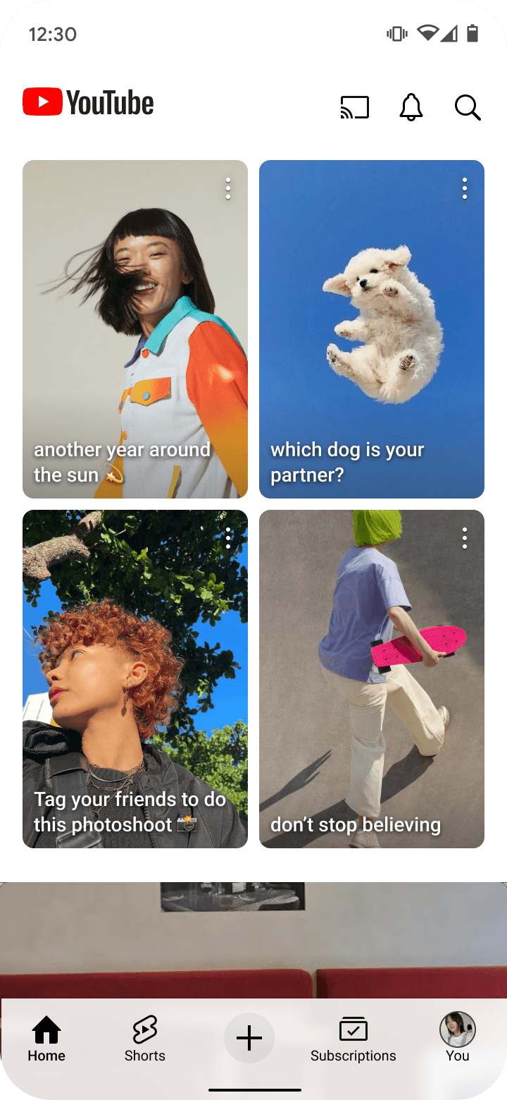
Home

Search

Channel

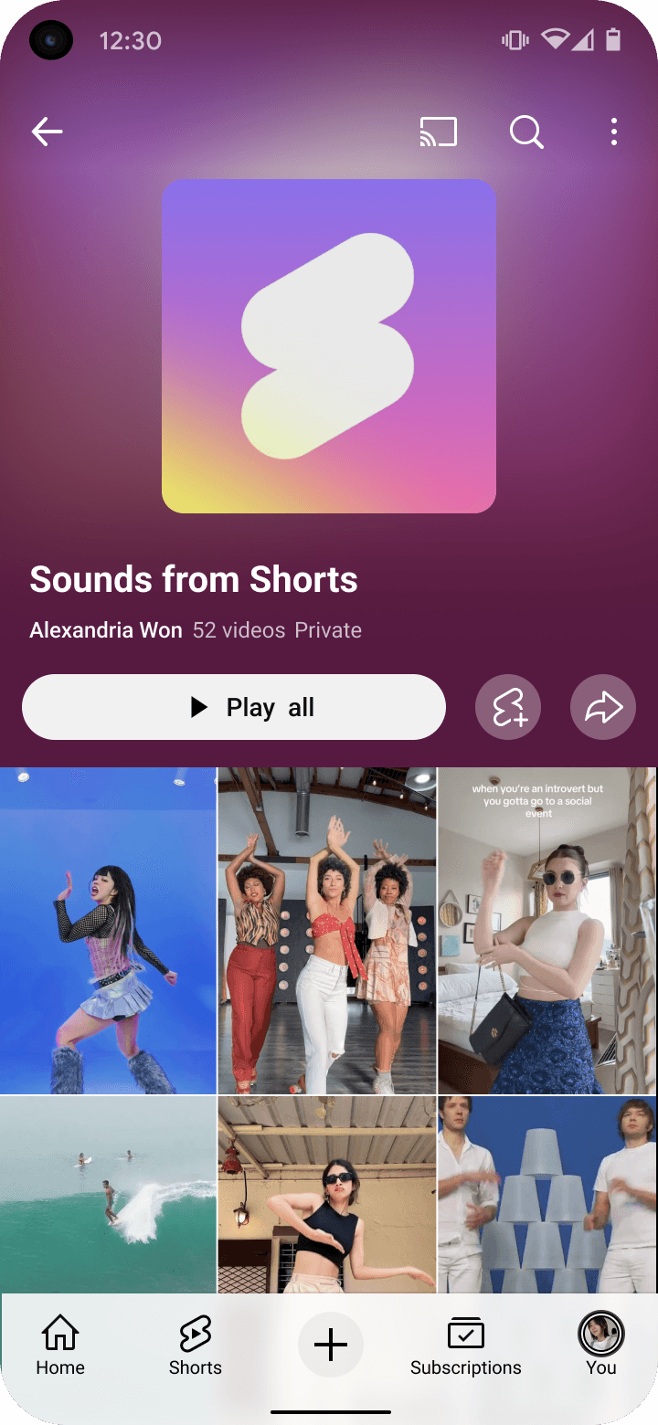
Sound page
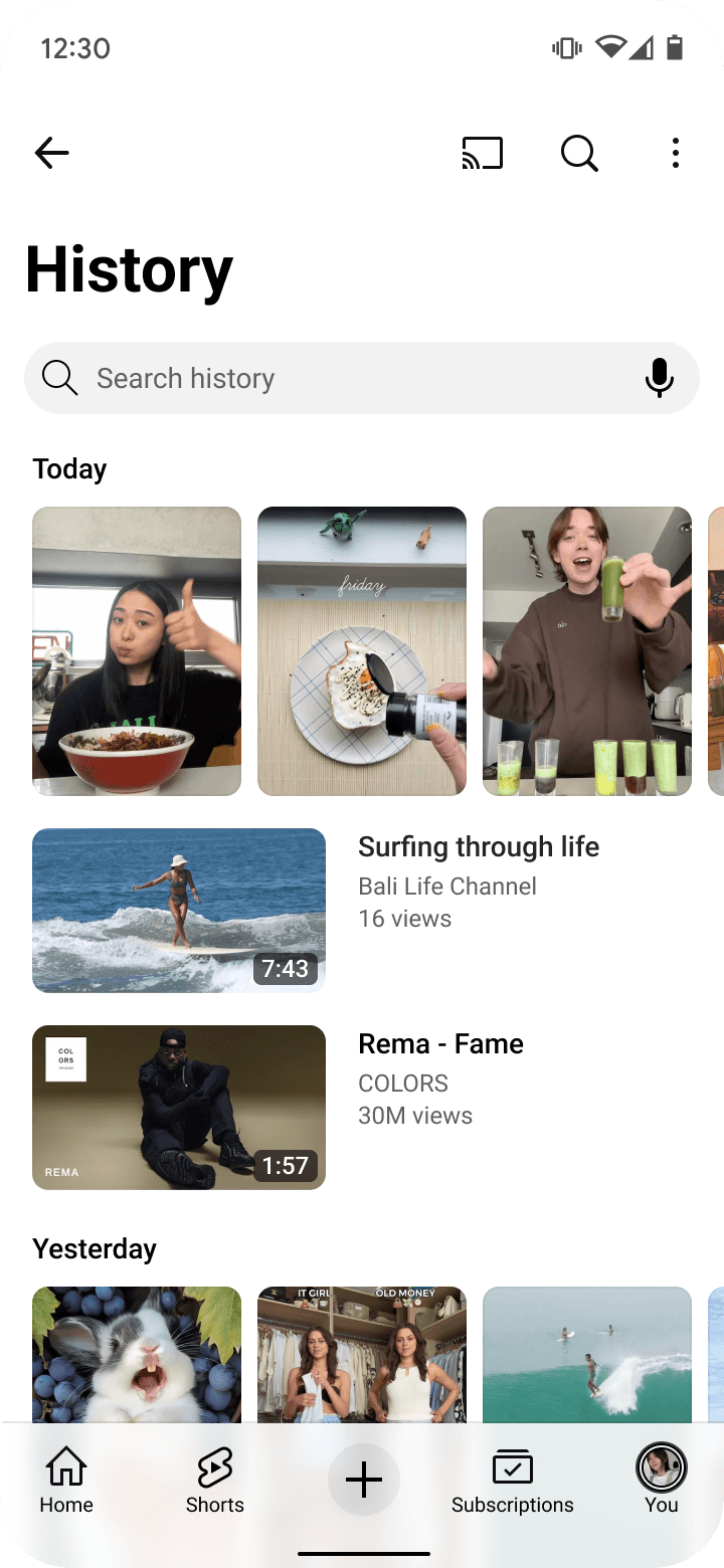
History
Playlist
Shorts trend page

Subscriptions

Shorts tab
Home

Search

Channel
Sound page

History
Playlist
Shorts trend page
Subscriptions
The real behind-the-scenes


YouTube Shorts
2020 ~ Current
Product area (PA)
YouTube Shorts Ecosystem growth
Role
UX designer, PA expert
Skills
Product thinking, System design, Influencing
One of the most defining chapters of my career has been helping the team build YouTube Shorts from the ground up, then taking the product to it's next feet.
I joined the team in the summer of 2019, just as we began uncovering the core needs around short-form video (SFV) through early research. Sensing we were onto something big, we pitched the idea to then-CEO Susan Wojcicki and spent the rest of the year experimenting and shaping the product strategy. With her support, the team embraced the mission to “give everyone a voice and show them the world” through a world-class mobile video experience.
It's been an experience like no other to have witnessed the evolution of Shorts firsthand—to learn, grow, and help shape what it is today. Four years since our global launch, I wanted to reflect on a few key lessons I’ve internalized while designing for YouTube Shorts.
*Note* This isn’t a comprehensive list of features or a one-size-fits-all UX playbook for SFV. Every platform has its own ecosystem, goals, and constraints that must be considered.
Team
YouTube Shorts Consumption - Acquisition Platform
Role
UX designer & go-to person
Skills
UX design, Product thinking, System design, Influencing
🚀 Impact
💡 4 unique lessons that changed the design of Shorts
Show don't tell
For short-form content, being entertaining is more important than being informative
Don't make users browse
More time people spend deciding what to watch, less satisfying Shorts become
One size doesn't fit all
There are many CUJs and business needs on YouTube.
Bring people together
One size doesn't fit all
Bring people together
At the end of the day, a single team can not solve all of SFV needs of YouTube. Recognizing this early on, I stepped into a connective role—becoming a go-to UX POC to many of our partner teams. I built trusted relationships across UX, PM, Eng, and Marketing to shape a cohesive end-to-end experience, while influencing teams to deeply empathize with the evolving needs of new-gen creators and viewers. This foundation helped shift Shorts from an emerging experiment to an integrated, global product presence.
Lesson 1. Show don't tell
Visual first experience
Through research, we learned that time is of essence for Shorts users when they just have a moment for entertainment. Fishing for content is not rewarding because it takes precious time away.
This insight helped us shape our product principles, and initiated efforts to minimize content obstruction (1), prioritize metadata (2) and enabled inline playback (3). Such projects always led to outsized impact, strengthening it's value with growing number of engaged users.
Lesson 2. Don't make users browse
Personalized grid layout
When we found out that vast majority of the users don't scroll horizontally on Shorts shelf, we explored layouts that would not interfere with a vertical scrolling behavior. It led us to experiment and launch the 2-by-2 grid that we have today.
Grids also opened a path for us to personalize interfaces. For example, users may see 1~3 rows depending on their affinity to Shorts.

Lesson 3. One size doesn't fit all
Flexible framework for different needs
As Shorts matured, we learned that there is a spectrum of user & business needs to support. One-size fits all was no longer feasible. Meanwhile, establishing clear guidelines and standardizing Shorts lockup became necessary to build a cohesive design system, to streamline process and to reduce technical debt.
With comprehensive understanding of dozens of partner teams' needs, I designed a flexible lockup system that teams can turn-on-and-off depending on their needs.
🚀 Launches
Shorts tab
Home
Search
Channel
Sound page
History
Playlist
Shorts trend page
Subscriptions
Shorts tab
Home
Search
Channel
Sound page
History
Playlist
Shorts trend page
Subscriptions